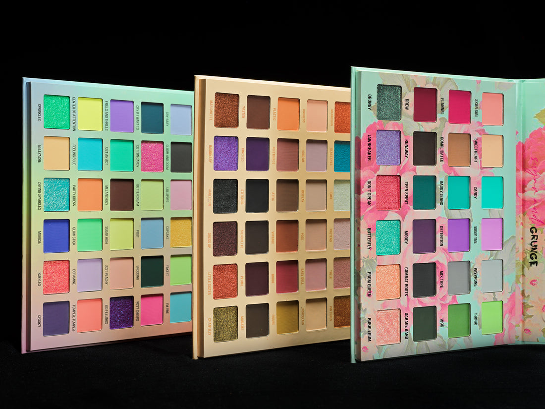
If you ever wondered why we do our own imagery when indie brands already have so many beautiful pictures and videos… it's not out of sheer love for visual art.
Brands do beautifully styled photoshoots, which give buyers a lot of insight into the product's story and aesthetics. However, one of the key things we love about indie makeup might play a trick when choosing products from different brands. Indie brands are diverse, each with a unique identity, style… and lighting conditions. With all these differences, making an apples-to-apples comparison is sometimes challenging. That's why we make our own imagery of all the products from different brands in the same conditions, with similar backgrounds and no styling.
What we really geek out on is making our imagery as true to colours in real life as possible. Because hey, the colour story is the key! We want to make sure that you fall in love with the same colour story online that will arrive on your doorstep. Here is what we do to achieve it:
- Light and white balance. We shoot all the products in a consistent light and ensure all photos and videos are correctly white-balanced. All cameras are white-balanced at 5600 Kelvin colour temperature, and we use light sources emitting light at this exact colour temperature to avoid colour distortion.
- Photo colour science. For our photoshoots, we use a Hasselblad X1D mirrorless camera, considered one of the best in colour science. No colour correction is done after, except for tiny exposure/contrast correction if needed.
- Video colour science. For videos, we initially used the Sony A6500, which has very decent colour reproduction. However, we wanted more than decent, especially when working with multichromes, so now we mostly use Blackmagic 6k G2, which is believed to have the best colour science in the prosumer cinema camera world. The approach for grading is the same: minimal exposure correction if there is a mismatch (not more than one stop, or else we reshoot), nothing else.
- Colour verification. The results are then verified on a professional colour grading display to ensure the resulting imagery most closely reflects the product colours.
This approach allows us to produce "reference" and "true to life" product images and swatches. The first image on the product page is always our in-house-produced reference image, followed by styled images provided by brands. This way, our customers have a complete picture.
Let us know if you have any questions or want to know anything else about our behind-the-scenes.
